


Unveiling the First Logo of McLaren: The Kiwi That Started It All
Ask any race fan about McLaren and they’ll picture papaya paint, ruthless efficiency in the pits, and road cars that feel like they’ve been hewn from a wind tunnel. But the part that always sticks with me is the badge. The McLaren first logo wasn’t a swoosh, or some abstract bit of aero. It was a bird. A humble Kiwi. And the way that little bird tells the story of Bruce McLaren’s grit, his home, and the brand’s evolution… well, you start to appreciate how a logo can carry a whole philosophy on its tiny shoulders.
How the McLaren First Logo Was Born
Wind the clock back to 1963. The newly formed team needed an identity, and the job fell to motorsport artist Michael Turner. His answer was disarmingly simple: a circular badge with a Kiwi at its center, a nod to Bruce McLaren’s New Zealand roots. No corporate fuss, no focus group polish—just heritage rendered in clean lines.
When I first came across the early badge in period photos, I noticed right away how unpretentious it felt. It wasn’t trying to look faster than it was. It was a reminder that even the greats start with a signature, not a slogan.

Why a Kiwi? The McLaren First Logo’s Meaning
The Kiwi wasn’t random. It was Bruce’s way of taking a piece of home on the road—across Europe, into Can-Am, onto F1 grids. The bird stood for the uphill climb: small, resilient, unmistakably New Zealand. A few longtime fans told me they still associate the Kiwi with the rugged, roll-up-your-sleeves era of McLaren racing—the one where Bruce and Denny Hulme turned up and, more often than not, disappeared into the distance.
From Kiwi to Speedmark: The Evolution of the McLaren First Logo
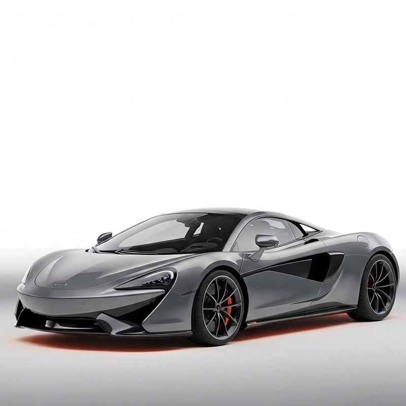
Brands grow. McLaren certainly did—expanding from a tight-knit race outfit into a global powerhouse, with Formula 1 titles and road cars that reimagined what “daily drivable” could mean. As ambitions stretched, the identity had to as well. By the late ’90s, the Kiwi gave way to the now-familiar “Speedmark” swoosh paired with the McLaren wordmark. It looked faster, felt more modern, and played neatly on a rear decklid or a race suit collar. Honestly, I wasn’t sure at first—I missed the earnest charm of the bird—but the Speedmark made sense for a brand living at 200 mph.
That shift didn’t erase the McLaren first logo; it framed it. The Kiwi represents origin. The swoosh represents motion. Together, you get a brand that remembers where it started while sprinting toward whatever’s next.

McLaren Visual Identity Highlights
- 1963: Michael Turner’s Kiwi roundel debuts—simple, personal, and proudly New Zealand.
- Late 1990s: The Speedmark arrives—clean, dynamic, globally recognizable.
- Motorsport continuity: Colors and cues echo F1 and Can-Am heritage without feeling stuck in time.
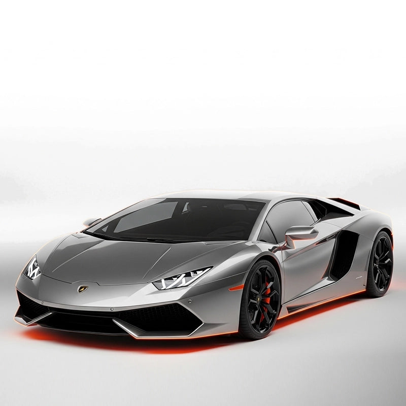
- Road-car versatility: Works on everything from the F1 to 720S and Artura—equally at home on nose cones and key fobs.
The McLaren First Logo in Context: Who Wore Their Story Best?
| Era/Brand | Badge Motif | Design Cues | Signature Cars |
|---|---|---|---|
| McLaren (1960s) | Kiwi roundel (the McLaren first logo) | Clean circle, bold bird silhouette, minimal type | Can-Am M6A, early F1 entries |
| McLaren (Modern) | Speedmark + wordmark | Swoosh signifying motion/aero, modern sans-serif | F1, P1, 720S, Artura |
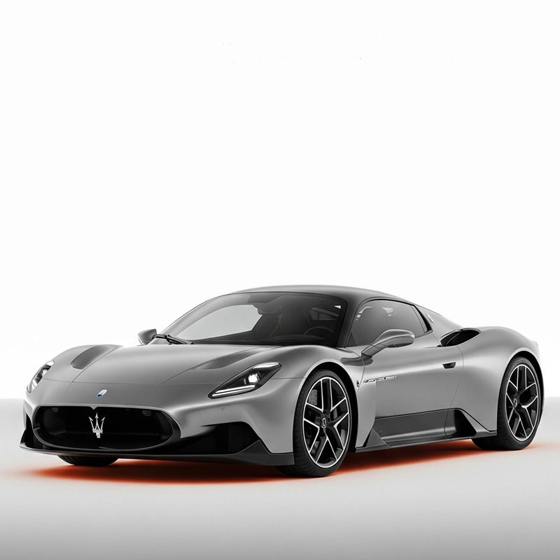
| Ferrari | Prancing Horse | Heritage shield, Italian tricolore, serif script | 288 GTO, F40, SF90 |
| Lamborghini | Raging Bull | Gold-on-black crest, sculptural aggressiveness | Miura, Aventador, Revuelto |
| Porsche | Stuttgart Crest | Historic coat of arms, layered symbolism | 356, 911, Taycan |
Legacy in Motion: What the McLaren First Logo Set in Motion
Beyond badges, McLaren’s impact is in the metal. I’ve driven a 720S on crumbling backroads and it rides like it’s levitating—yet it’ll do 0–60 in about 2.8 seconds and feels tidier than a hot hatch when you lean on it. The P1? That blend of electric shove and twin-turbo V8 thunder (a combined 903 hp) changed the way we talk about hybrid performance. You can trace the brand’s confidence back to that first, quietly defiant Kiwi: start small, punch high, never stop refining.
Everyday Ownership: Add-Ons That Make Sense
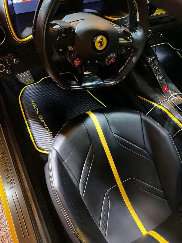
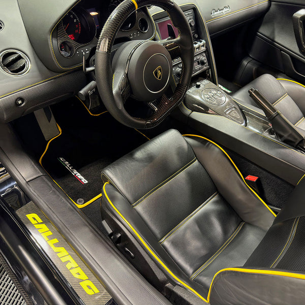
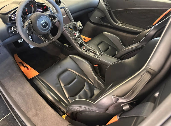
Real life creeps into even the most exotic cabins—sand after a beach run, gravel from the driveway, a coffee mishap after a pre-dawn start. If you’re keeping your McLaren tidy (and resale-friendly), small upgrades matter. Interior accessories—especially well-fitted floor mats—save you from scrubbing Alcantara at midnight.
For owners who want pieces that fit and feel OEM-level, I’ve pointed a few to AutoWin. Their kits tend to be neatly cut and durable, and they don’t scream aftermarket. If you’re browsing, start here:

Why the McLaren First Logo Still Matters
The McLaren first logo is more than nostalgia. It’s a compass. That Kiwi made it clear: this was a team with roots and resolve. The modern Speedmark made an equally clear promise: relentless motion. Together they tell you exactly what you’re buying when you buy into McLaren—heritage, speed, precision, and that slightly obsessive attention to detail we all secretly love.
FAQ: McLaren First Logo
- Who designed the McLaren first logo? Motorsport artist Michael Turner created the original Kiwi roundel in the early 1960s.
- Why did McLaren use a Kiwi? The Kiwi honors Bruce McLaren’s New Zealand roots—small bird, big heart, fitting the brand’s underdog-to-dominance story.
- When did McLaren switch to the Speedmark? The shift took place in the late 1990s as McLaren expanded globally and modernized its identity.
- Does McLaren still use the Kiwi? Not on current cars, but the Kiwi lives on in historical materials, team heritage, and enthusiast memorabilia.
- What’s the best way to protect a McLaren’s interior? Quality, model-specific floor mats are a smart start—see the AutoWin McLaren collection for options.
Premium Accessories for Mentioned Vehicles
Custom-fit floor mats and accessories for the cars in this article